
Just sharing resources: This is a graph I had my students working with in class after struggling with a similar homework problem.
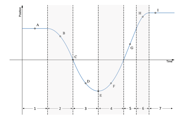
- I first had students identifying whether points A-I were moving to right, to the left, or not moving.
- I then had students identifying whether sections 1-7 were speeding up, slowing down, or moving with constant speed.
- I then had students work on constructing a velocity vs. time graph.
Lots of other questions could be asked.

With the y-axis just labeled “position”, I can’t tell whether the object is moving left, right, up, down, towards me, away from me, or in some other direction. There either needs to be a caption, or the y-axis needs a more informative label.
Thanks. Yes, I agree. I’m not sure it’s what is best, but On all our in-class clicker questions and paper tasks, we tell students to assume a “+ = right” and “- = left” perspective unless other wise noted. This reduces the cognitive load of “reading”, and helps makes it possible to have large enough font for the monitor. I understand that you don’t want to always reduce this specific load for students, but it is what we are doing here, at least for now.
If the +=right convention is explicit in the context (noted elsewhere on homework or quiz), then I’ve no objection. Blog posts often leave out such context, in an attempt to focus on the currently interesting point.
I noticed that you had no units on either axis, which I assume was an attempt to get students to focus on concepts rather than numbers. I can understand the appeal of that, but as an engineering professor, I find myself having to remind students over and over that units matter—I require all their plots to have explicit units on both axes.