

N2nd Law Lab: Half Atwoods with 1 kg mass

Brian reflects on his physics teaching

I asked the two dropped stones questions to a small class I have of intermediate and upper-division physics majors. This class is called “Reasoning in Physics I” and has evolved quite a bit over my time here. Anyway, after some intro to class and some diagnostic pretests, I wanted us to do some physics, so the question was asked:
“A dense stone is dropped from tall building. One second later an identical stone is dropped. As the two stones are in free fall (ignore any drag), does the distance between the stones increase, decrease, or stay the same. ”
Majority of students’ first thought was that it should stay the same at first (since acceleration is the same), but one student quickly convinced the others that they should increase because the first one got a head start on getting up to speed.
When the conversation naturally came to a lull, I re-voiced the conversation a bit, emphasizing how everyone seems to have good reason to believe that something is the same about the two stones (e.g., they have the same acceleration), but that some things might be different (because of the one second head start).
I prompted students to get up and go to a whiteboard and draw position vs time and velocity vs time graphs for the two stones. I then told students that they should be ready to explain (1) how those graphs illustrate what is the same and what is different about the two stones, and (2) how and whether the graphs illustrate the answer to the question.”
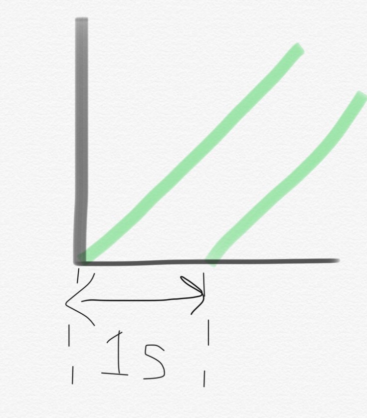
Students struggled with the graphs for a bit, not at first being able to distinguish the position vs time from the velocity vs time. Eventually, one of the groups drew a diagram like this:
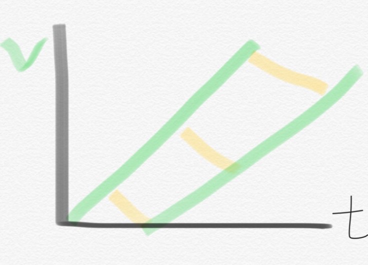
The idea at the time seemed to be that the two lines had same slope, and the widening space between the the two lines showed the two stones’ increasing distance. Quickly, another student suggested that if the two had the same slope, the two lines had to keep the same distance apart on the graph.
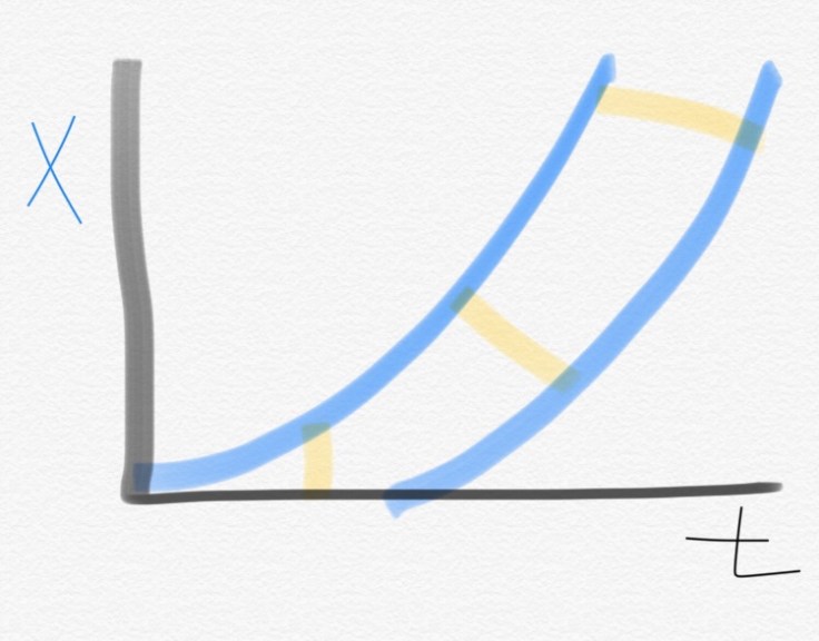
Students corrected their velocity graph, so it showed lines with the same slope. The next graph they worked on was the position vs time and it sort of looked like this–with each yellow line to them being an indication of the increasing distance between the two balls.
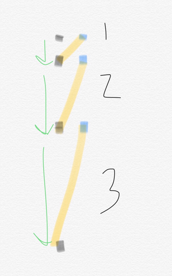
I asked them a few questions about their graphs and got them to articulate how their two graphs showed the 1 second time delay. I said, “I’m going to label on the graph, in a particular way, something to help ussee that 1 second delay.” This made their graph look like this.
I then asked them to see if they could go about marking their position vs time graph, similar to how I had, where specific information is labeled as to clearly communicate how and where to “see” that information.
I left for a bit and came back to see thy had updated their drawing like this.
 They were able to more clearly articulate what each of those lines meant. As discussions continued , I shared them with another representation using motion diagrams.
We ended the day talking about the different representations, even raising the question about how one might show the idea using the velocity vs time or even equations to illustrate increasing separation. We didn’t have much time to explore that, however.
Anyway, this class is going to be interesting to navigate. I’m definitely figuring out what the goals are supposed to be a bit on the fly. So far, we had a good first day, of reasoning through talk and diagrams.